Tuesday, November 3, 2009

New ways of seeing

Storyline threads

My husband has sometimes wished for a way to track characters in a book as he's reading. He often reads several books at a time, so progress through one is slow, and it's easy to lose track of events or who's who. Today he came across an example of one way someone did that for several films (it should work equally well for books, I think). It traces intersecting story threads in a simple but effective way. We've both wondered whether authors use such devices for themselves when plotting a book.

Looking at the top map, for Lord of the Rings, the creators used different colors to represent hobbits, elves, men, and other creatures. Time flows from left to right, and important events and locations, such as Bilbo's party and Isengard, are represented in different places on the map.

It's interesting to compare maps of different stories, on the bottom row. The map of 12 Angry Men shows 12 parallel threads. Without seeing the movie, this is ambiguous, because it could be interpreted either as all interacting together the entire time, or having no interaction. (Adding context, such as an enclosing space labeled "Jury Room", could help.) It looks like Primer would be confusing: Just three characters, whose lives intertwine messily, with no landmark places or times, and whose final fates are unclear! I suppose some lives feel like that at times. (I found out it's about time travel, from this Wikipedia entry.) From xkcd, via Flowing Data.

Evolution of thinking

I have trouble, sometimes, committing myself to a conclusion, because I recognize that my understanding is always evolving as I get more information and consider more points of view. Many scientists and others seeking "truth" can probably relate. The evolution of one scientist's thinking over the course of 13 years is traced in a visualization of changes in six editions of one of his books. With different colors representing each edition, if you let this play out, you see how words are added and removed, and, dramatically, how an entirely new chapter is added. I also discovered that if you hover your cursor over a section, you can read the words, in the color representing the edition in which they were added. The work traced is Charles Darwin's famous On the Origin of Species by Means of Natural Selection, first published in 1859, with the 6th edition published in 1872. From Ben Fry, from this CNN article, "A new way of looking at the world", via Flowing Data.

Saturday, October 24, 2009

Elephant Egg 5


I was one of 5 presenters at the latest Elephant Egg event on Oct. 22. This was the best one yet, in my opinion. None of the presenters used bullet points, or read us their slides! In fact, all used the medium in the way recent research says is most effective: the visual content on the slide and the presenters' spoken comments complement and support each other.

Barking
"Dr. Kate" Kathleen Ireland, a science teacher at Seabury school, shared her experience of the trip of a lifetime, going to the Galapagos Islands with other teachers. She told us how excited she was when her application was accepted: she felt like Charlie, in Charlie and the Chocolate Factory, winning the golden ticket. She told us that all the animals, and even the people, bark, and used that as a metaphor for getting people's attention to recycling and other ecological concerns.

Uncovering Pa`u
Linda Lindsay gave a graceful and dignified presentation about her current film project, a documentary about the pa`u riders - Hawaiian women who ride horses - and their traditions, a piece of Hawaiian culture that few are aware of. You can follow her work by becoming a fan of her Facebook page.

Visual Language

(Click to view a video of my presentation on YouTube. I'm mostly a silhouette in the shadows, but the presentation and audio are pretty clear.)

My presentation had an audacious goal: to teach the audience a new language! I provided a worksheet to make it an active learning experience and was pleased to see almost everyone participating. Having a table full of friends to support me made it so much easier to make my first public presentation - thanks for being there for me, Jeff, Jeff, Francine, Ann, and Don! And thanks to Gabe, who couldn't be there, but suggested doing the video.

Here's the presentation on Slideshare, if you'd like to review it or read through at your own pace.


Wander
Paul Wood, a writer and educator, did a multi-media performance piece accompanied by music by Duke Ellington, commenting poignantly on a current issue, the diversion and restoration of Maui stream water.

Maui forest birds
Mike Neal came to Maui years ago to surf, but has recently discovered a new passion in the cloud forests on the slopes above us, photographing and working to preserve native birds of Maui. These birds are extremely rare, with only a few hundred individuals (of some species) surviving in the world.


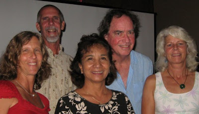
The presenters, from left to right: Kathleen Ireland, Mike Neal, Linda Lindsay, Paul Wood, Karen Bennett.

Thanks again to Maggie Sutrov and Ian Blakeslee for organizing this evening of inspiration! They are planning another event next month which promises to be fascinating: The Reverse Origami Film Festival, which will feature short (5 minutes or less) videos by Maui film makers, on Nov. 21.

Saturday, October 10, 2009

Simple pictures for complicated situations


"Solving problems and selling ideas with pictures."

That's the subtitle of Dan Roam's best-selling business book, The Back of the Napkin. Wait, did you say business book? That sounds like a pretty "lite" title for a business book. Well, a book doesn't have to be ponderous or dense to be useful. In fact, the more accessible, the more likely the ideas will be considered and adopted. Dan's book is clear and well-organized, teaching how to use visual thinking to analyze business problems and communicate clearly about them.

Political issues rarely get this kind of treatment. Buzz words and emotion rule, with little rational analysis or explanation for the average citizen. Dan and a doctor decided to provide some perspective on the current health care reform debate. He posted a 4-part presentation on his blog, using simple hand drawings, to explain the factors involved, the types of proposals being considered, and how individuals will be affected under each. It was such a breath of fresh air that Fox News had him go through some of it on-air, and Business Week magazine and Slideshare.net named it the best presentation of 2009 in a recent contest.

Another example of the power of a simple drawing is the "rich picture." I learned about these a few years ago. Last week, Dave Lash turned me on to a useful diagramming tutorial site which is part of a university-level systems thinking curriculum. For 6 different diagram types, self-paced Flash movies explain when each is most useful and how to draw them. Transcripts of the narration are also provided.


A rich picture is a sort of hand-drawn info-graphic, used in the very early stages of an analysis to explore the issue and surface assumptions. This diagram examines a controversial situation in England a few years ago. Here are some comments on the diagram by its creator, from the accompanying transcript (I've emphasized some points that make rich pictures so valuable, in my view):
I don't think rich pictures can be used to depict everything in a problem situation, I think they are devices for some kind of discrimination - you are actually saying what you think are the important issues, and you have to decide on what’s important according to the purpose the rich picture is being constructed for, for a particular problem situation.

In this case my purpose was just to try and gain a general understanding about the miners’ situation.

It can be used as a personal device, so you can explore your own understanding. When you begin to put symbols down on paper and to draw the rich picture, you begin to question your own understanding and it can throw up questions for yourself about what you understand and what you don't understand. It begins to put some structure on the problem situation from your own personal perspective.

It’s probably got a number of faults in it, and I think that’s one of the strengths of a rich picture. It makes you begin to declare assumptions, and because you are declaring and discussing those assumptions, they can be challenged by other people. So your understanding of the situation can be explored, challenged and modified by the debate that ensues. The power of a rich picture is that it provokes that kind of debate, there’s a bit of visual interest there that can spark off thought, you can visit the rich picture randomly, you can move around on it which is stimulating for debate in itself.
I haven't had a chance to go through all the diagram tutorials in detail yet, because I'm preparing a presentation for the next Elephant Egg night. (In developing this presentation, I'm experimenting with the methodologies of Cliff Atkinson and Andrew Abela, who have both recently published excellent books aimed at helping people communicate more clearly in presentations.) If you're on Maui, you might enjoy stopping by Moana Cafe on Thursday, October 22 at 6:30 for an evening of serendipity and new ideas!

Wednesday, August 5, 2009

Are you in flow?


Artists, athletes, researchers, and others with a passion for their work or hobby know what it's like to be in a "flow" state. They lose track of time, and feel at one with with what they're doing. The flow state arises under certain conditions - just the right amount of challenge relative to the person's skill level - pushing it, but not too much. This graph shows the flow state in the upper right, and the feelings associated with other combinations of challenge and skill.

This graph is from this Wikipedia page, which I found in this note in this blog post by Merlin Mann on how to get past the obstacles that stop you from starting a creative or challenging project.

Monday, June 29, 2009

Elephant Egg 3


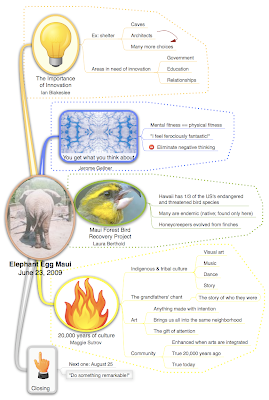
The third "Elephant Egg" night of pecha kucha style presentations was held at Moana Cafe last Tuesday night. It succeeded in sharing the presenters' passions with the audience, and giving us some new ideas to think about. See photos on Maui Jeff's blog.

(Click the mind map image above to view it in a readable size!)

Saturday, June 20, 2009

New VISUAL search engine


I just found a great new search engine. You can scan through the results like Apple's cover flow. Check out http://www.searchme.com/

Wednesday, May 13, 2009

Elephant Egg in Maui!


One night a couple weeks ago, I attended an event called "Elephant Egg," held at Moana Cafe. Maggie Sutrov's invitation promised "Five Presentations by Five Inspiring People." I recognized the format as pecha kucha, which I'd heard of but never experienced (20 slides shown for 20 seconds each, for a total of 6 minutes and 40 seconds). I was out of town at VizThink for their first event, so I made a point of going to this one. It was defnitely worthwhile!

There were five presentations:

  1. An outrigger canoe trip to Kure in the Northwestern Hawaiian Islands, by Peter Nice
  2. Photos from a trip to India near Nepal (above 15,000 feet!), by Daniel Sullivan
  3. Likability, by Bob Sommers
  4. Spiral Dynamics, by Ian Blakeslee
  5. The future of newspapers, by Maui News reporter Ilima Loomis
The format kept the presentations short and focused, and gave just enough information to be intriguing and open opportunities for questions. They're planning to hold them every couple months, so the next one will probably be in late June.

Sunday, March 29, 2009

Art history class 1 summary


Dick Nelson has started an 8-week art history class. We're at the halfway point, and I've been reviewing my notes and starting to summarize them.

In our first meeting, we did two exercises designed to introduce some organizing principles and basic concepts that we'll be working with and going into more depth on in coming weeks. We started by comparing two works by different artists in different periods - see this post. Then we played a game, matching works of art and architecture to their period, to learn "where" in time the periods occurred, and some classifying characteristics. See the game board and more details here.

Monday, February 9, 2009

More on VizThink '09


There are a few things I forgot to include in my earlier post about VizThink '09.

Dave Gray has a great post, detailing why he thinks you need to go. He says VizThink is different than other conferences, because VizThink is about:

  • Differences
  • Innovation
  • Design
  • New Voices
Read his post for the details.
If you're planning to go, look for the registration discount code at the end of his post to save money on your registration!

You might want more information before you decide. Just look at the session descriptions, and facilitator bios, and you're sure to be intrigued.

Saturday, February 7, 2009

VizThink '09


My husband and I collaborated on a T-shirt design this week, inspired by our plans to attend the VizThink conference later this month. We wanted to show an aspect of why visual thinking is valuable, and exciting to us. We'll be wearing our long-sleeve Ts at VizThink, and they're available on CafePress at http://www.cafepress.com/visualthinking/.

The VizThink conference starts in just two weeks, on Feb. 22. It's two-and-a-half days with some of the world's leading practitioners of visual thinking and visual communication. Last year's facilitators included two people - Nancy Duarte and Cliff Atkinson - who, through their work and recently published books, are changing the experience of millions of people who spend much of their time in meetings, by teaching new ways to conceive and design presentations. Dan Roam, another facilitator, shared concepts from his (at the time) soon-to-be-published book, The Back of the Napkin. This book was named one of the top 5 business books of 2008 by Amazon and several business publications. Many of last year's greats will be returning, and there will be new people with new ideas. It's sure to be very stimulating for anyone interested in effective visual communication, an increasingly important business skill. (Click on the VizThink08 label to see my posts on last year's event.)

Tuesday, January 13, 2009

Immerse yourself in color!


My friend Gabe is planning to build an exciting - real world - interactive demonstration of the relativity of color for an art festival on Maui in February. You'll be able to to go into a room and change the color of the walls, based on where you point.

See his blog for a more complete explanation, and be sure to try out the demo! Play around with changing the colors (mouse over the colored matrix). I love the "light switch" by the "door"! Click on the video floor mat to see and hear his description, and click on the "Donate" button if you feel moved to support this project!